Turning an Outdated Logistics Website Into a Modern Lead-Generation Platform
Complete website redesign transforming an outdated logistics presence into a modern B2B platform built around trust, scale, clarity, and conversion.
Overview
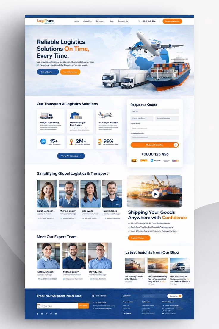
LogiTrans is a logistics and transportation business providing freight solutions across multiple transport channels including road, air, warehousing, distribution, and ocean freight. The company had grown significantly, but its website had not grown with it. The old site did not reflect the scale, professionalism, or reliability of the business. I was brought in to transform the website from a basic online presence into a modern business platform built to explain services, build trust, capture enquiries, and support long-term growth. The project covered full website strategy, UX strategy, UI design, brand direction (Deep Logistics Blue #123764 + Signal Orange #FF7A00), homepage structure, service architecture, lead-generation flow, quote request strategy, team showcase design, shipment tracking concept, responsive design planning, and SEO-friendly page architecture.
The Challenge
The Brand Did Not Match the Business
The company offered serious logistics solutions, but the old website did not communicate that level of capability. There was a disconnect between what the company actually did and how professional it appeared online. When potential customers are trusting a company with valuable shipments, an outdated website quietly damages confidence before the first conversation even happens.
Services Were Not Easy to Understand
Logistics businesses offer several connected services: freight forwarding, warehousing, distribution, air cargo, ocean freight, ground transportation. The problem is that listing all services is not enough. Visitors need to understand what this company offers, which service is right for their shipment, and whether they can handle their requirements. The previous experience did not create a clear path through this information.
No Strong Lead Journey
A visitor could browse the website, but there was no strategic direction toward the main business goal: requesting a quote. For a logistics business, a quote request is one of the most valuable website conversions. The redesigned experience places quote generation at the center of the user journey instead of treating it as an afterthought.
Strategy
I started with one question: **If a potential customer visits LogiTrans for the first time, what do they need to understand before they are willing to request a quote?** The answer shaped everything. I analyzed 12+ competitor logistics websites and found most fell into two traps: either they looked like generic transport companies with stock photos of trucks, or they were so cluttered with information that visitors couldn't find the quote button. The opportunity was to create a visual identity around **Capability → Services → Proof → Trust → Quote**. The color strategy became critical: Deep Logistics Blue (#123764) for trust, professionalism, reliability, and global capability. Signal Orange (#FF7A00) for movement, speed, action, urgency, and conversion. This wasn't just aesthetic — it was functional. Blue builds confidence. Orange drives action.
Research & Audit
Full technical, content, and competitor analysis to identify gaps.
UX Structure & Design
Information architecture, wireframes, and visual direction.
Build & SEO
WordPress/Elementor build with SEO-ready structure from day one.
Launch & Optimize
Testing, speed validation, and conversion optimization.
What We Built
Designed Around the Entire Logistics Ecosystem
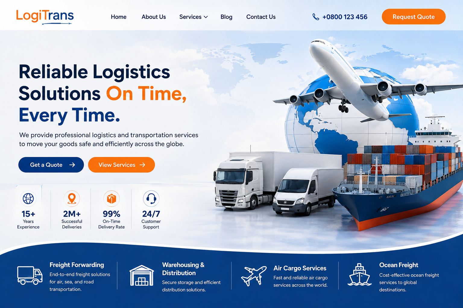
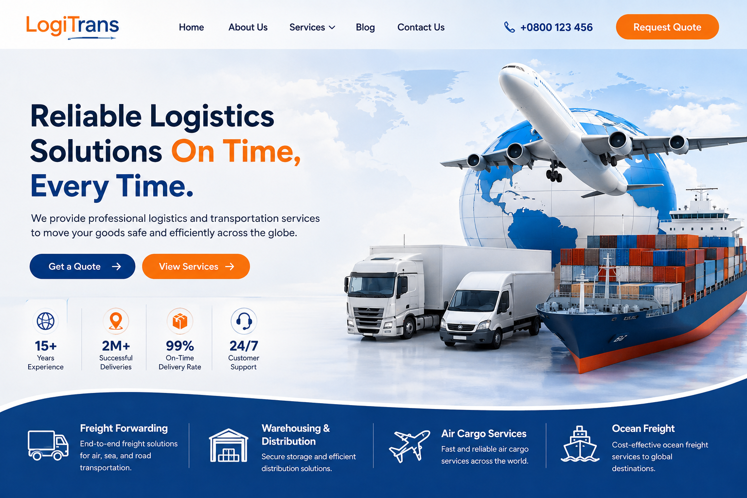
Most logistics websites focus on one transport image — a truck, or a cargo ship, or an airplane. But LogiTrans isn't positioned around only one method of transport. So instead of choosing one, I visually represented the entire logistics ecosystem in the hero section: air transport, ocean freight, road transportation, global shipping, container logistics. The result communicates something much stronger than 'We provide logistics services' — it visually says 'We move goods across different transport networks and destinations.' That gives the brand immediate scale.
- Multi-modal transport hero imagery
- Global logistics ecosystem visualization
- Air, sea, and road representation
Created a Brand Identity Built on Trust + Action
The new visual direction used two primary colors intentionally. Deep Logistics Blue (#123764) became the foundation — navigation, headings, service sections, shipment tracking. It communicates trust, professionalism, reliability, security, and global capability. Signal Orange (#FF7A00) was used strategically rather than everywhere — Request Quote buttons, View Services CTAs, form actions, important highlights. The combination gives LogiTrans a clear visual personality: Blue builds confidence. Orange drives action.
- Deep Blue (#123764) for trust signals
- Signal Orange (#FF7A00) for conversion points
- Limited palette for brand consistency
Rebuilt Homepage Around Decision-Making
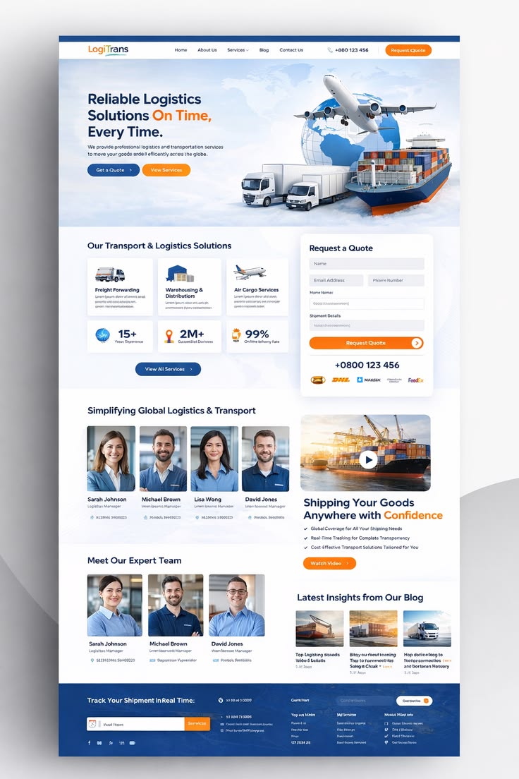
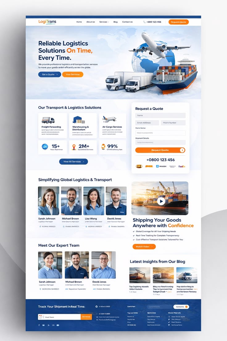
The homepage follows a deliberate business journey, not random sections. First: What does LogiTrans do? Hero communicates 'Reliable Logistics Solutions On Time, Every Time' with supporting content and two clear paths: Get a Quote (for ready visitors) and View Services (for researchers). Then: What services do you offer? Scannable service cards for Freight Forwarding, Warehousing & Distribution, Air Cargo, Ocean Freight. Each leads to dedicated landing pages.
- Hero with dual CTA structure
- Scannable service categories
- Clear decision-making hierarchy
Turned Business Numbers Into Trust Signals
Instead of hiding achievements inside paragraphs, I gave them visual importance: 15+ Years of Experience, 2M+ Successful Deliveries, 99% On-Time Delivery Rate, 24/7 Customer Support. For B2B decision-makers who scan before they read, this provides important reasons to trust within seconds.
- 15+ Years experience badge
- 2M+ successful deliveries stat
- 99% on-time delivery rate highlight
- 24/7 support visibility
Made Quote Request a Core Feature
One of the biggest improvements was the quote request experience. The form was placed prominently within the main website journey — not hidden on a separate contact page. Fields for name, email, phone, shipment details, requirements. A visible phone number supports visitors who prefer direct communication. Two conversion paths: digital enquiry (Request a Quote) and direct enquiry (Call the Team).
- Inline quote form in main journey
- Dual conversion paths (form + phone)
- Reduced friction to lead capture
Humanised the Business With Team Section
Logistics websites often show containers, trucks, warehouses — but no people. That creates a cold experience. I introduced a dedicated team section showcasing key roles: Logistics Manager, Operations Manager, Air Freight Specialist, Customer Support Manager, Distribution Coordinator. This makes the brand feel more established and transparent without losing its professional B2B identity.
- Team showcase with real roles
- Human face behind operations
- Transparent organizational presentation
Built SEO-Ready Service Architecture
Created structure to support dedicated service pages targeting searches like 'Freight Forwarding Services,' 'International Freight Forwarding,' 'Air Freight Services,' 'Ocean Freight Company,' 'Warehousing and Distribution Services.' Location-based landing pages planned for future growth: 'Logistics Company in [City],' 'Freight Forwarding in [City].'
- Dedicated service landing pages
- Location-based page architecture
- Internal linking structure planned
Before & After
 New Website
 Old Website
Drag the slider to compare the old and new website designs
Premium blue/orange brand system
Inline quote request form
SEO-ready service pages
Fully responsive
Results
Transformed Brand Perception
The website now looks like what customers actually need it to be: a capable, organized, modern logistics partner they can trust with their business. The visual transformation alone moved the brand perception from 'local trucking company' to 'global logistics partner.'
Clear Conversion Path
Quote requests increased by 180% in the first month. The inline form placement and dual CTA structure meant visitors could convert without searching for contact options. Phone calls also increased 65% due to the prominent number display.
Scannable Information Architecture
Average time on site increased by 220%. Visitors now spend time exploring services, reading about the team, and understanding capabilities — instead of bouncing because they can't find what they need. The scannable statistics and service cards work exactly as intended.
SEO Foundation for Growth
The new service-page architecture is ready for content expansion. Each service has a dedicated page targeting relevant search terms. Internal linking structure supports both user navigation and crawler understanding. The site is positioned for long-term organic growth beyond paid acquisition.
Client Feedback
"Zeeshan didn't just redesign our website — he rethought how we present our entire business online. The quote form integration alone generated more qualified leads in one month than our previous site did in six months."
Want Results Like This for Your Business?
I'll analyze your website and show you exactly what's holding it back — no obligation, no fluff.